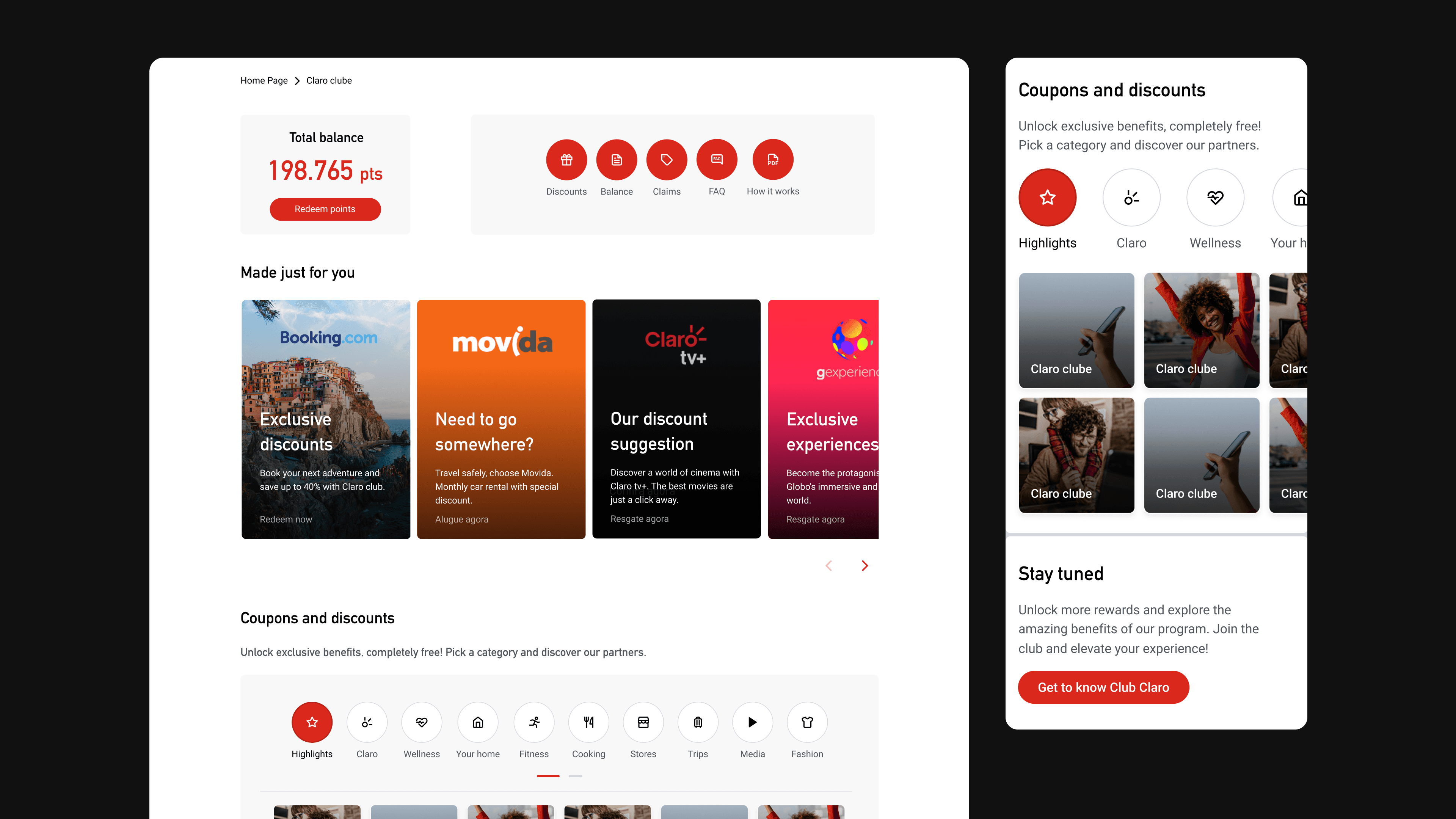
Claro, a telecom provider, offered exclusive coupons from different stores on their products. However, this feature was not profitable enough due to low engagement.
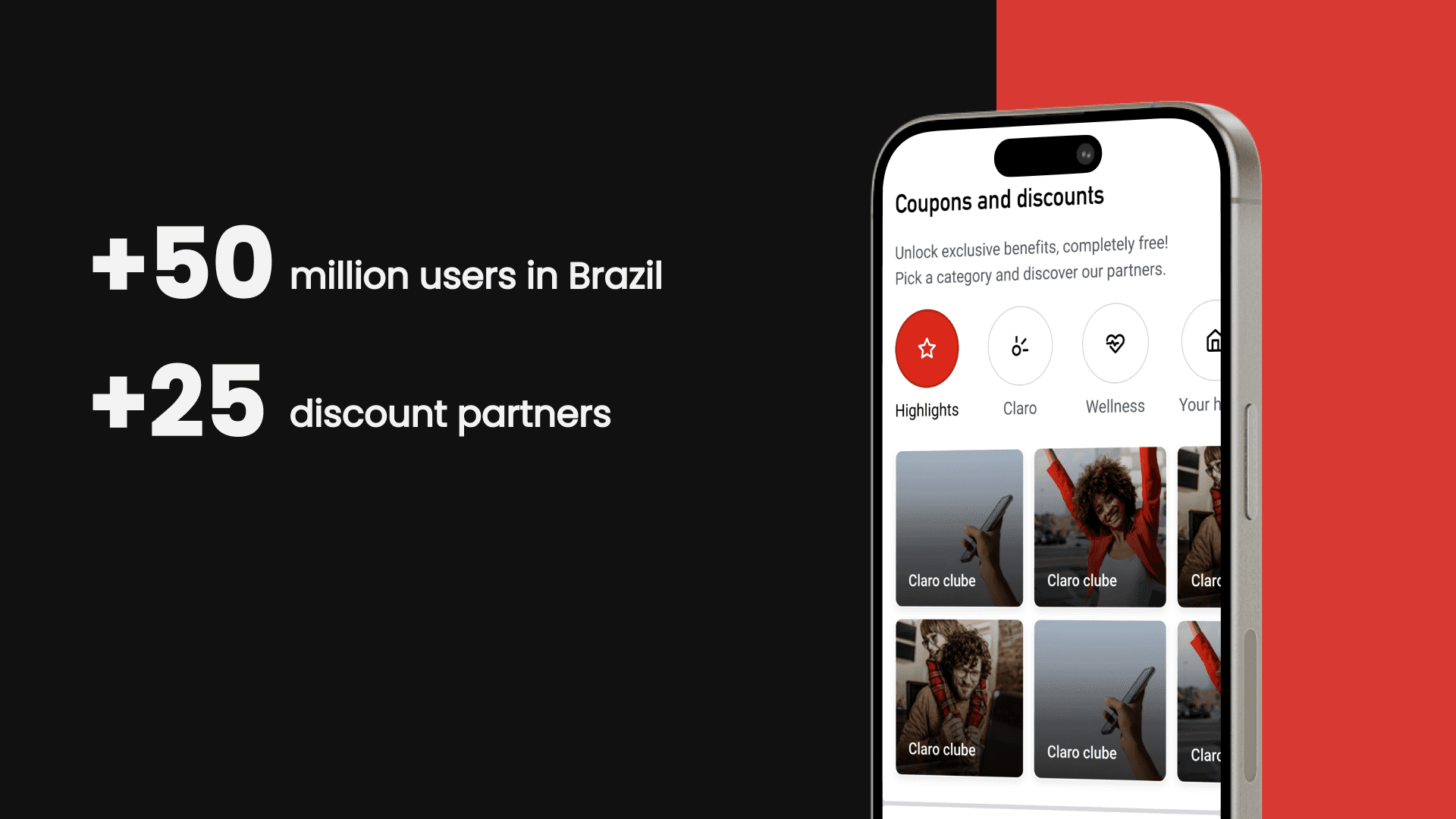
Our partners were unsatisfied with how many people were accessing their page through our coupons. I was able to increase the click-through rate of the coupons by 15.29% on the website and 5.99% on the App.
Original layout
The product's home page was made out of four information blocks, presented in the following order:
Header with Account balance and Menu
Highlighted partners coupons or discounts
All coupons and discounts (main pain point)
Secondary information and CTA's


Since this was my first project on the team, I focused on getting to know our users and digging into the data around our product and partner brands. I also dove into the page performance accessing the company's Hotjar, Google Analytics and all available business reports.
With that background, I benchmarked how similar coupons were presented in the market to identify potential improvements for our product.
Unfortunately, management's focus on rapid implementation prevented a deeper dive into the user experience research, but these initial steps already allowed me to identify some problems that could be quickly solved.
The heatmap analysis revealed that users were not scrolling all the way to the bottom of the page, where the discounts were located. This probably happened due to the page having too many items (vertically).
Also, even when they were scrolling, they were not necessarily clicking on any coupons and my assumption was that there weren't enough visual cues to make the coupon's understandable / attractive.
Lastly, there were no instructions on the use of these coupons and the fact that they were a free perk.
Design choices
For better and faster recognition, I opted to add the brands' logos.
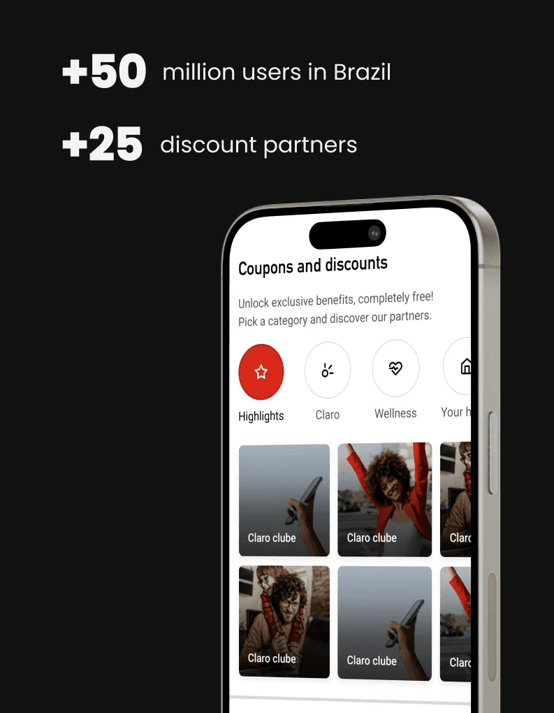
For easier navigation, I changed the section into a single block with only two vertical columns.
To enhance the visual experience and understanding, I added extra categories with icons and created subtle click animations.
To explain to users that they wouldn't spend their points to use coupons, I added a subtitle on the section.
Lastly, to make coupons more attractive and increase user's curiosity, I excluded any specific explanation of the coupon itself from the home page and added a pop-up modal after the coupon selection. This was positive because it also allowed us to add an accessibility step that would indicate users would be leaving our page in case they wanted to continue.