A new HR Tech startup based in Brazil. Aimed to change hiring processes for companies by offering digital tools with data and content from top-notch recruiters.
The team was receiving negative feedback when selling our recruiting services because of how we were showcasing candidates (on PDFs) and due to not having a platform to follow the screening processes.

I was invited to the company to lead a small design team of two other UX/UI Designers. My initial challenge was to gather all information they had until that point and create a product that would meet business requirements, while also bringing a well-crafted digital experience to users.
It was my responsibility to define the design approach, frameworks, tasks and division of the project with the Product Manager. Also, while the project was made by both me and my team, I was the one responsible for most of the UI and User Flows - and the ones I wasn't creating, I was guiding and validating (specially copywriting and research).


* Screenshot of PDF that recruiters used to showcase candidates' and all their analysis.
Gather and analyze data
Interviews with HR Professionals
Personas
Benchmarking
User Flow
Since it was a new product, almost everything was made from scratch. We started by gathering information from stakeholders about their business goals, while also analyzing current clients and their representatives.


We then interviewed 3 different HR professionals with distinct backgrounds. We focused on aspects of their daily professional activities and personal preferences, in order to give us a better idea on their habits.
With all of that, we defined 2 proto-personas that would guide us on the creation of the product.


Due to it being a relatively new product in Brazil, we had to expand our view while doing the benchmark. We searched different segments and other countries to give us a broader view on how to show data and complex info.
At last, we created our first user flows, contemplating the steps seen below:

High-fidelity and testing
We made low-fidelity screens and got stakeholders approval in order to start prototyping.
With the high-fidelity UI done, we selected a group of 8 different people who were not our clientes to test the product on Maze. The users were chosen based on either one of our personas and the test result can be seen below:


One of the main discoveries we had with the test was that the users preferred seeing more information on a one-page format, rather than splitting it into different categories as we had originally done with the candidate's profile.
We also received feedback that some information were confuse or not important and that users were not finding other points that they thought were more relevant to their decision.
With all data gathered, we started to aim at the second - and more refined version of our project.
Even though we were able to do many important steps from a design-perspective, our time was up and we needed to release the product right away. So we handed everything off and started to gather more data for next improvements.
Data-driven design


Project's results
Within a couple of months, we were able to do a first version of the product, test it, review it and redesign it with live data - and even though the first design was released immediately, our development team was able to quickly change anything we handed-off as a redesign.
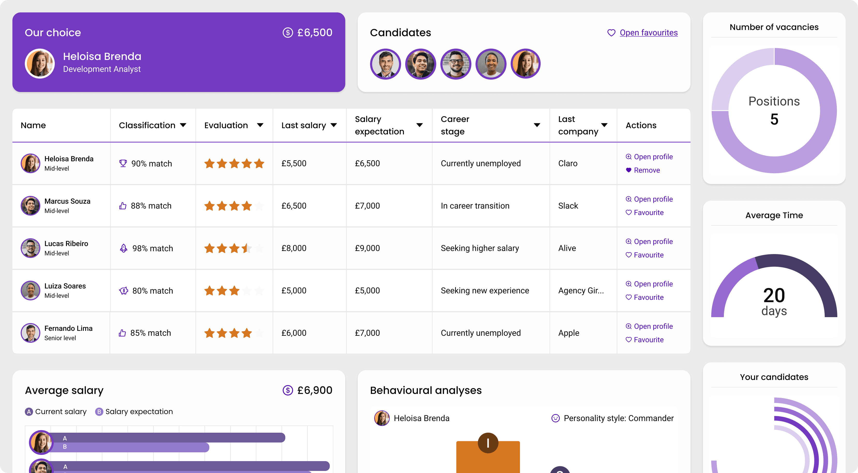
The screens below show the result of this project, which enabled clients to access not only their shortlist, but also screening data and candidate's full profile.
Home Page


Data from screening process and candidates


Client's shortlist with candidates


Full candidate's details and profile


Results, metrics and final thoughts
Since this product is brand new, we don't have performance metrics yet. However, we're projecting increased sales due to its innovative nature and are closely monitoring team reports to track progress.
Over the next few months, we'll collect data from Hotjar and Analytics to better understand product performance. We've also scheduled feedback sessions with recruiters (who work directly with users) to gather insights on areas for improvement and future features.
One challenge we faced was a reduced design team, which caused a slight schedule slip and prevented pre-release testing. While this didn't impact the previous project, it did lead to some anticipated negative feedback from recruiters regarding known issues.
Another challenge was convincing the business team and recruiters that less text and content on candidate profiles would improve user experience. The final product, therefore, contains more text than we wanted, though we incorporated visual cues and data to enhance the UX/UI.
Overall, this was a valuable project that provided significant learning opportunities in HR, ATS, dashboards, and, most importantly, leading a design team to successfully launch a new product.